Oaza Shawarma Plus - UX/UI Redesign

Introduction
Oaza Shawarma Plus is an Egyptian/Italian fusion restaurant in Mississauga. The owner, Alex, wanted to revamp his entire business, including his website, social media, menus, equipment, and actual restaurant. Alex hired our team to help him do so.
This project is a work in progress, and this case study shows the UX/UI design I have completed thusfar.

Overview
My role as a UX/UI Designer was to redesign Oaza's website, company branding, and menus (both display and in-house).
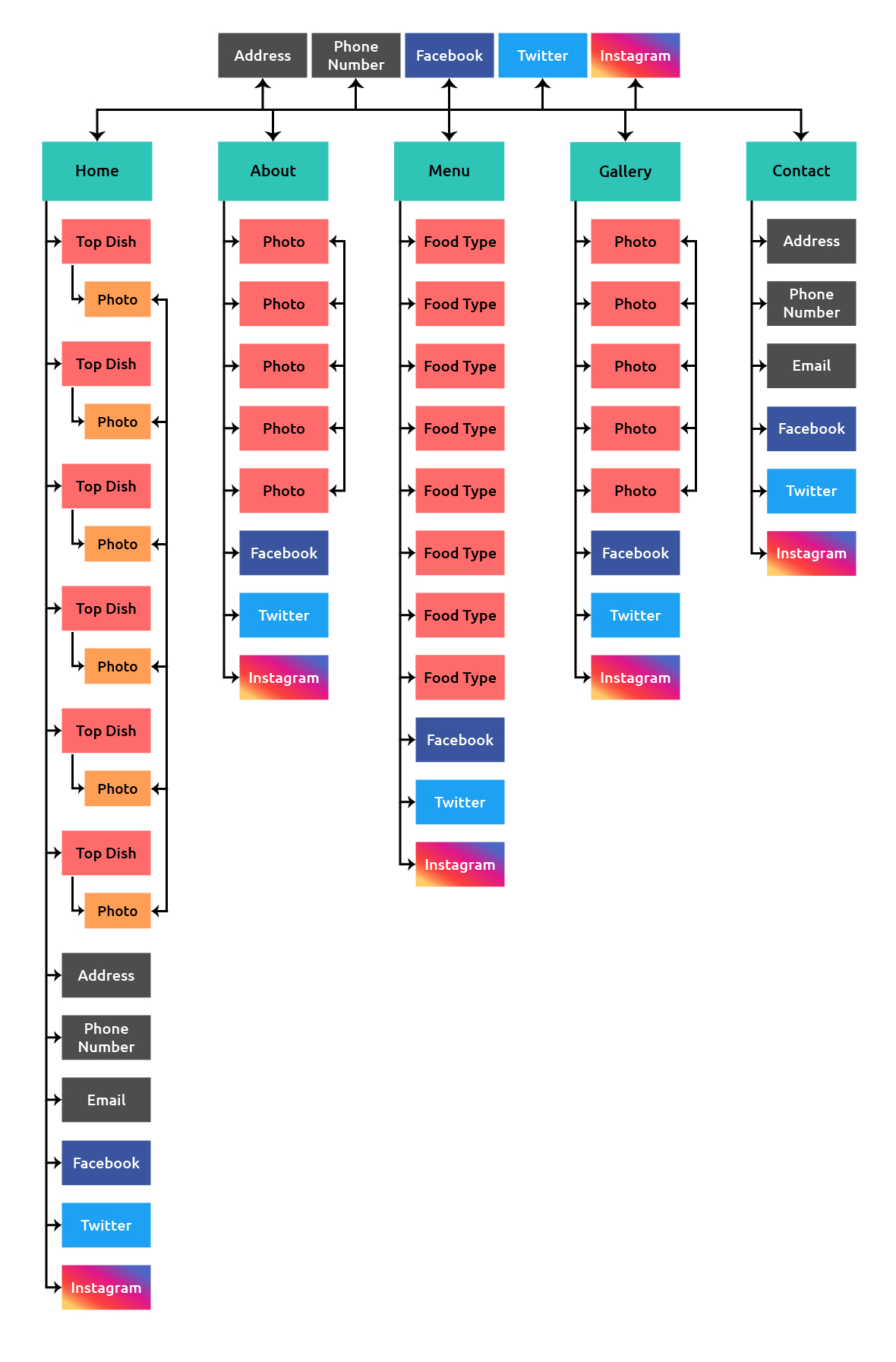
The Old Website & Site Map

Website Redesign Overview
Main Issues
1. The interface is very outdated and unattractive.
Proposed Solutions
1. Design a better, more modern-looking website.
2. The website doesn't mention Italian food, only Egyptian.
2. Brand Oaza as a fusion restaurant on the home/about pages.
3. The feedback page doesn't work/exist.
3. Link to customer reviews (Google Reviews, Yelp, etc).
4. The descriptions of food items are redundant and confusing.
4. Simplify descriptions to reduce clutter, and be clearer.
Planning
Sketches & New Site Map
Wireframes
I created lo-fidelity wireframes based on my previous sketches, which I then used to create a prototype of the website. Try the prototype out for yourself!

Responsive Design
Aside from designing the website for PC/laptop, I designed for different devices: iPad/tablet and mobile.
iPad/Tablet Landscape: elements are slightly compressed, slightly smaller fonts used.
iPad/Tablet Portrait: elements are further compressed, intro photos are smaller, Top Dishes reduced to 2 columns.
Mobile: top bar elements are reduced to icons, navigation bar is converted into a hamburger menu, intro photos are converted into background with intro text overlaying, Top Dishes and Customer Reviews horizontally scroll, smaller fonts are used.

Usability Testing
I created an interactive prototype of Oaza's website, which I used to conduct usability tests with users, and restaurant owner Alex.
I had
them carry out tasks, noted their pain points and comments, and recorded
their feedback with each iteration. I then used my findings to improve
the following iteration.
I held additional tests and surveys with users to help choose final UI elements, such as format, color palette, fonts, and logo.
Color Palette

Typography

Logo

Menus
The old display and takeout menus were not visually appealing. Furthermore, the pizza and shawarma menus were separated. I designed several iterations because the menu items had to be adjusted by Alex for the pandemic.


Prototype
I created an interactive prototype of Oaza's website to be tested, then ultimately referenced by our team's developers. Give it a try!

Follow Oaza:
Give Oaza a follow or like, but most importantly, try their pizza. 10/10.

Thank you for reading.
Have a great day.
A very special thank you to those who helped with or inspired this case study:
J.D, C.L, S.B, M.F, L.B, Y.F
More of my work:


